It’s that time of year again when organisations start to think about their annual reports. It’s a busy time for us graphic designers as we embrace the challenge of making these documents look enticing and easy to read.
What is an annual report ?
“The report on an incorporated company’s affairs that must be sent to shareholders after the end of the financial year. Such reports include an audited statement of the company’s affairs as well as reports from the management of the company.”
The Handbook of International Financial Terms
While an annual report fulfils a company’s legal obligations and is a repository of accurate financial information for shareholders and stakeholders it can also be used as a marketing tool. By highlighting past performance, presenting future direction and aspirations as well as demonstrating brand values it can be a valuable document for potential investors or a wider audience (such as donators to a non-profit organisation).
Good design can make a report clear, inviting and easy to read with data presented in a way that’s easy to understand. A strong concept can help tell a story and humanise an organisation with case studies and stories about their people and achievements.
Strategic considerations need to be thought through before jumping straight to design.
- Purpose: strictly regulatory/regulatory and marketing
- Audience: stakeholders/wider scope could include general public, potential investors etc.
- Delivery: online/printed
- Design approach: utilitarian simplicity/conceptual story-based
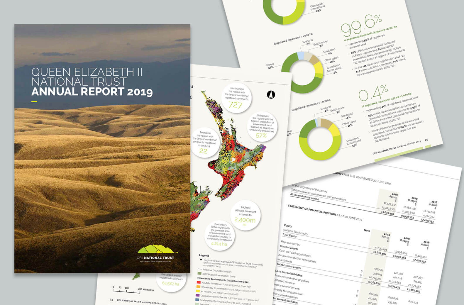
Image: Queen Elizabeth II Trust Annual Report 2019, Pogo Design
Annual report delivery
More recently I’ve noticed a shift away from annual reports being part glossy promotional brochure and part regulatory document for a wider audience, towards a more utilitarian report focused on shareholders and stakeholders with a minimal print run and published online as a PDF. This shift could reflect a wider move towards digital communications and away from traditional off-set printing.
Benefits of a digitally published (PDF) annual report include:
- Time
- A PDF file published on a company’s website takes minutes to upload
- A print run of an offset printed document can take days
- Costs
- Supporting a digitally published PDF with a smaller number of digitally printed hard copies can be significantly cheaper than offset printing a large run of reports
- Waste associated with excess out-of-date physical copies is avoided
- Links to further information can be contained in the PDF document or sign-posted on the company’s webpage
Benefits of a printed annual report include:
- Impact
- A tangible object can be more visually and physically appealing
- Easier to read
- Implies quality through paper choice and print finishing
- Audience appropriateness
- Hard copies are preferable for some audiences
- Can be provided as part of a marketing package
Some annual reports are published as a microsite, with visuals and audio-visual content. One of my clients has moved back from a web microsite to a combination of a PDF hosted on their website with a small number of digitally printed hard copies.
The cost benefits of producing online content was offset by the costs associated with building a new website and needing to significantly change it each year – hence the move back to PDF and a few hard copies.
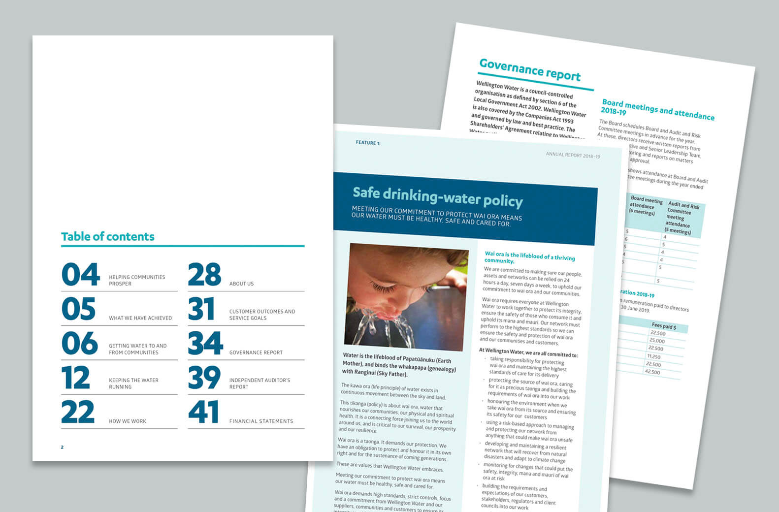
Image: Wellington Water Annual Report 2019, Pogo Design
Design – how to make it look great!
An annual report can be a company’s flagship document so it’s important that it represents the company’s branding at its best. Design considerations include:
- An enticing cover
- Easy to read content, employ lots of white space – less is more
- Easy to navigate content with section styles, colour coding etc
- Strong photos and images
- Employee or customer quotes
- Infographics, icons, tables, charts, maps and diagrams
- Bold typographic highlight statistics
- Snackable content with a clear heading hierarchy and pull out sections
- Mandatory requirements like web address
- Auditor’s reports may have to remain in the format they are provided
- Respecting the brand guidelines
- Knowing the production/delivery method. Online, printed and digital documents have different technical requirements.

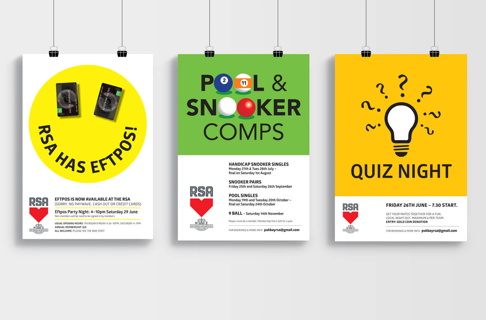
Image: Xero Annual Report winner of Best Design Awards 2018 designed by Studio A-Z
Along with the clever design you’ll need some creative ideas to put some flesh on the report’s bones. These might include:
- Highlighting people (employees, recipients or customers)
- Snapshot/day in the life/moments in time
- Past/future facts and figures
- Story of why/highlight of values
- Hero photos, graphics or illustrations
- Multiples of photos/images to create impact
- Typography
- Focus on data with numbers or infographics
- Timeline device
- Environmental or social focus

If you have any annual report questions, feel free to get in touch.

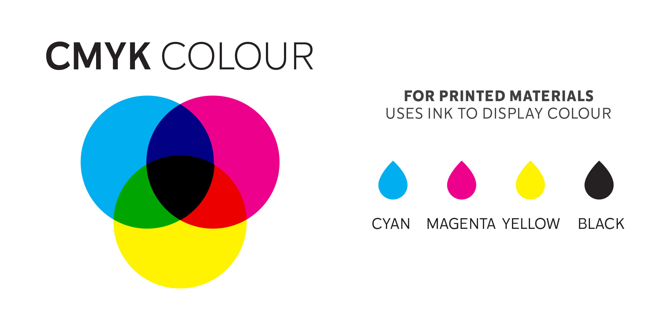
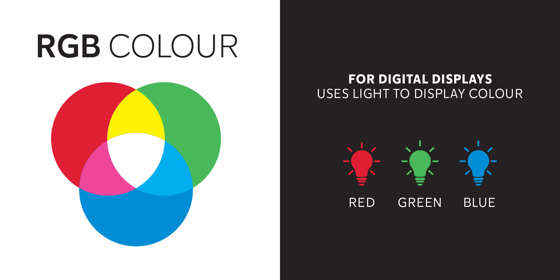


 Photo by Karolina Grabowska from Pexels


 Johny vino, Pierpaolo Riondato, Nadine Shaabana, Eckhard Hoehmann on Unsplash
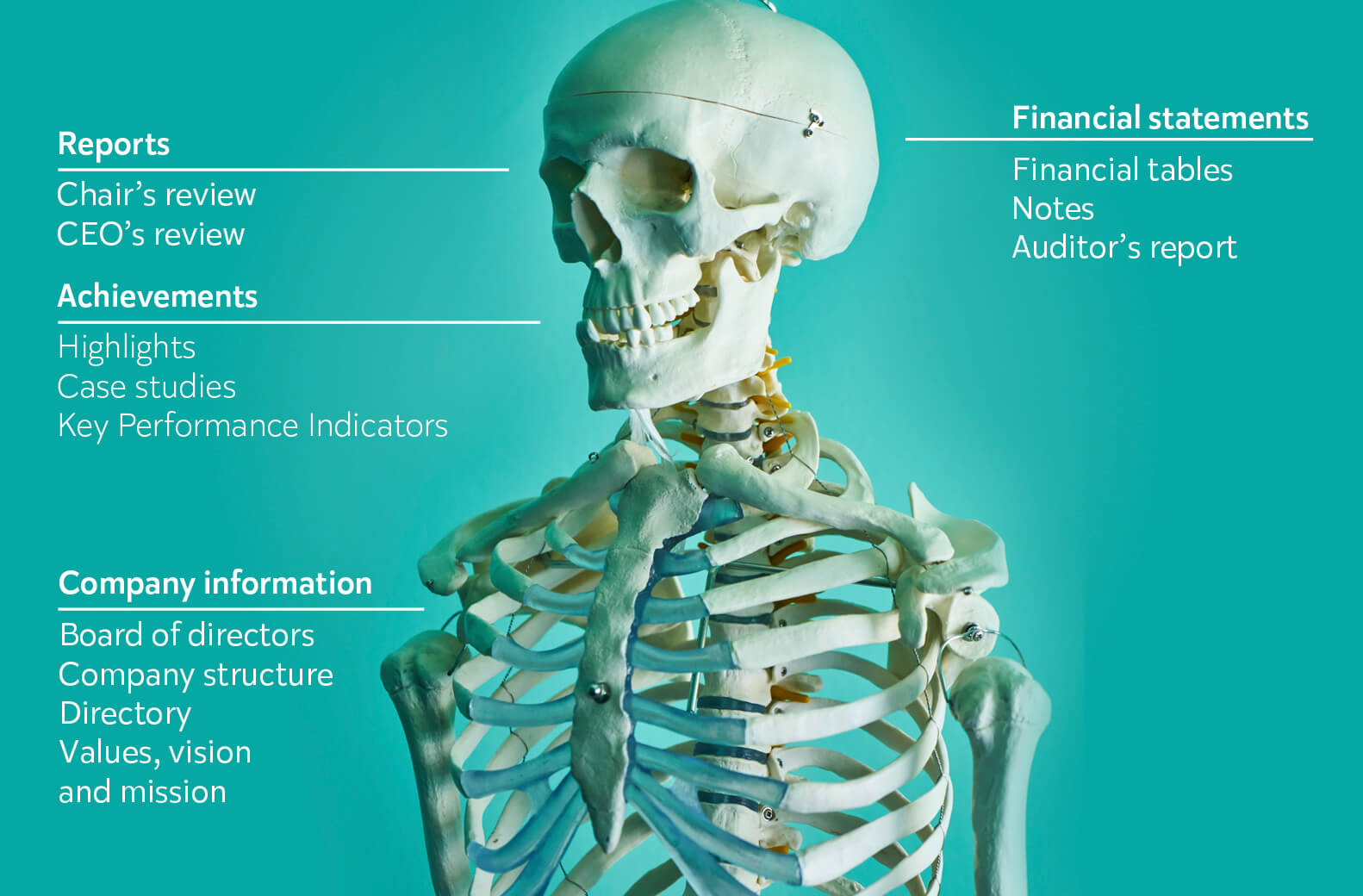 Pexels.com