• Link to Facebook
  • Link to Instagram
  • Link to LinkedIn
Ph: 021 136 1745 / hello@pogodesign.co.nz
Pogo Design
  • Home
  • About Pogo
  • What I do
  • What my clients say
  • Portfolio
  • Resources
  • Blog
  • Get in touch
  • Click to open the search input field Click to open the search input field Search
  • Menu Menu
Graphic Design, Helpful Information, infographics, Print Design

Growth in bilingual signage

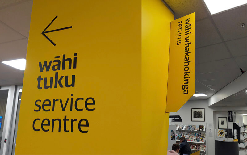
Yellow wall with a left pointing arrow with the words wahi tutu service centre with library shelves and people reading in the backgroundPogo Design

Some years ago, I was involved in one of the first bilingual traffic signs in Aotearoa New Zealand for Porirua City Council. It got some media attention at the time and I’ve noticed that bilingual signage is becoming much more common.


Tree-lined suburban street with cars and a blue road sign with white words that read āta haere slow down

Porirua’s first bilingual road signs mark the streets around Takapuwahia Marae.


Some of the examples I’ve seen are council signage by Porirua City Council and Wellington City Council.


White pole with a blue sign against a bright blue sky

Porirua City Council signage in Pukerua Bay, Porirua.


Out of interest, I looked to see if there were any bilingual signage guidelines out there. I found that Te Puni Kōkiri, Ministry of Māori Development have put out a resource called ‘Māori-English Bilingual Signage. A guide for best practice’.

Their objective for developing the bilingual signage guidelines is to “Increase the visibility of te reo Māori in public spaces within the government (central and local) extending to business sectors, and thereby increase the usage of te reo Māori in every day conversation.”

They say when developing bilingual signage the key principles are:

  • Responsive and accessible services
  • Visibility of language
  • Equality of language
  • Quality of language

Te Puni Kōkiri says that embracing te reo Māori and culture in everyday public life helps establish a shared national identity and builds goodwill and social cohesion within Aotearoa New Zealand. That it’s a good business practice as it can help build staff pride, morale, and loyalty.


“Bilingual signage also offers the opportunity for organisational development through building staff capability to speak te reo Māori, and therefore their ability to work with Māori communities, and to communicate and negotiate with a range of customers in diverse situations.”


Te Puni Kōkiri’s guide is based on international literature and the United Nation’s best-practice principles of bilingual and multi-lingual language planning guidelines adopted in policies and guidelines in many countries. They say “the typographic rules applying to bilingual signage as an internationally recommended standard shows the “first language” (the one being revived), i.e.
the Māori text is at least as large as the font for the English text even if the text in one language is longer. Further, if this is not practical in terms of the eye easily reading at a glance, then the Māori text should dominate. The rationale is that English is an international language that most people know and understand. Customers will, therefore, have little difficulty in navigating themselves towards a building or within its work-spaces, or websites.”


“It makes sense to have the Māori on top; that’s how we keep the language alive.” DEPARTMENT OF INTERNAL AFFAIRS


Black panel painted on a white wall with the words wharepaku toilets and some toilet icons

Bilingual toilet signage in Arapaki Manners Library, Wellington City.


All great stuff but how exactly do we put that into practice? What does it look like?

Luckily TPK have distilled the main design points into a PDF.  I’ve listed their Do and Don’t points below.


Cream panel with various bilingual signs

Some tips taken from TPK’s “Design tips to support quality bilingual signage” PDF

Bilingual signage tips

DO:

  • Have the font for the Māori text at least as large as the font for the English, even if one text runs longer.
  • Use an equal typeface for the Māori and English.
  • Use the same font style for the Māori and English.
  • Apply colour coding to text and or language – separating background panel.
  • Be consistent in all signs with the same colour and position for each language.
  • Consider how a pictogram might reduce the amount of text required.
  • Place Māori first, either stacked or side by side.
  • If both Māori and English cannot be easily read because signage is ‘visibly biased’ consider having the Māori only.

DON’T:

  • Assign a heavier font or colour for English.
  • Apply a dominant visual style to English.
  • Use italics or symbols (– or /) to separate Māori and English.
  • Squash Māori to match English text.
  • Use CAPITALS to differentiate languages (e.g. CAPITALS and upper and lower case).
  • Double up on icons.

As always there is more to learn, and I look forward to putting these tips into practice.


Here are some of the resources I found that you might find useful:

  • TPK ‘Maori-English Bilingual Signage. A guide for best practice.
  • Bilingual Signage – translation of common words
  • TPK design tips pdf
  • Te Reo resources
  • School-related signage
  • NZTA research notes on bilingual signage
  • ReoMaori Bilingual Signage blog


July 4, 2022
https://www.pogodesign.co.nz/wp-content/uploads/2022/06/BLOG-Bi-Sign-Service-Centre.jpg 502 800 Jane Comben https://www.pogodesign.co.nz/wp-content/uploads/2024/06/UPDATE_POGO-LOGO-297x300.png Jane Comben2022-07-04 14:12:002022-07-04 14:26:59Growth in bilingual signage
Graphic Design, Helpful Information, infographics

Infographics – making information more accessible (2/2)

pie chart showing illustrations and percentages of different types of travelwww.pogodesign.co.nz

Communicating information rather than driving sales

What if your aim is to impart information to an audience that isn’t particularly engaged? Or the data is technical, complicated or copious? The answer is often to simplify where possible and cherry-pick the most pertinent or surprising facts.

In a previous blog I talked about the quirks of designing for the public sector  and that the challenge of making information easier to ‘take in’ and comprehend is something I deal with a lot. Here are some approaches that I’ve used to highlight facts or tell a story:

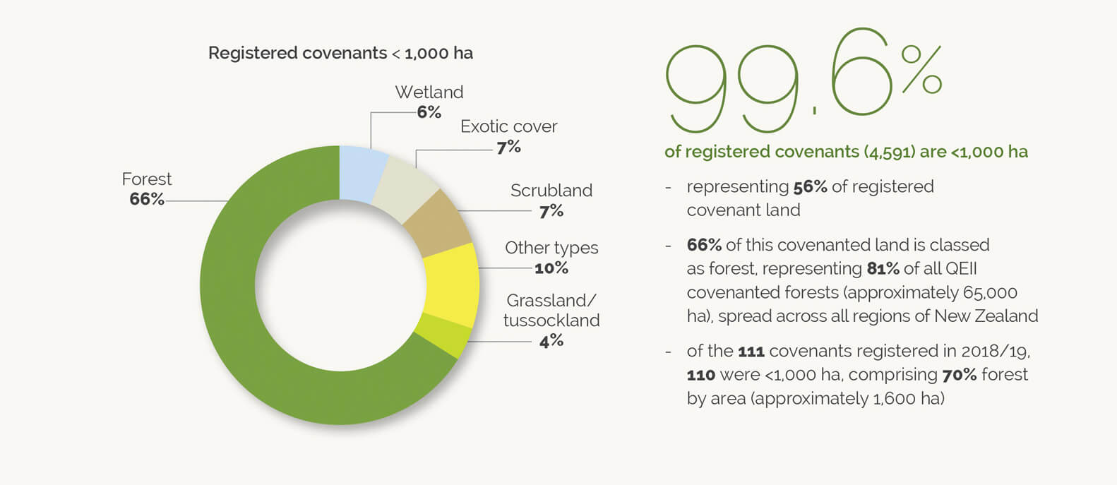
1) Pull out percentages and enlarge for visual impact

pie chart

A pie chart and pull out percentage from the QEII Annual Report, designed by Pogo based on their existing brand guidelines.


2) Multiple symbols to represent quantities

A snippet from Pogo’s Annual Report for Capacity.


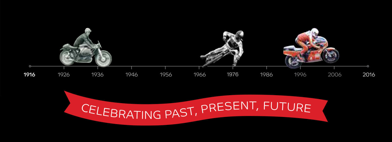
3) Timeline

timeline showing photos of different types of motorbike

TImeline to celebrate 100 years of Motorcycling New Zealand by Pogo.


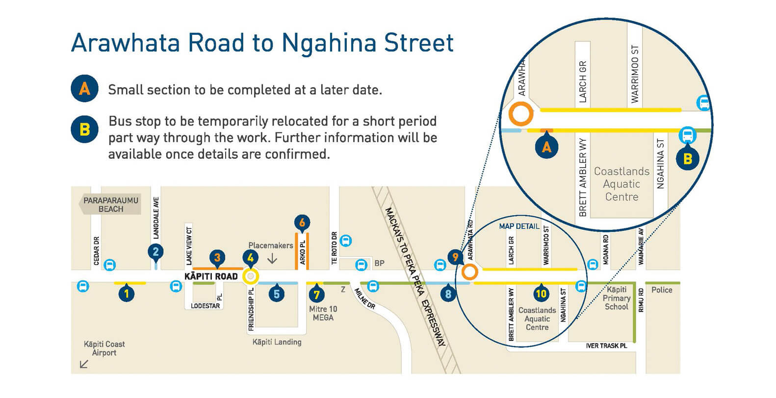
4) Maps

Road upgrades on Kapiti Road were shown on this map design by Pogo for Kapiti Coast District Council


5) Icons/pictograms

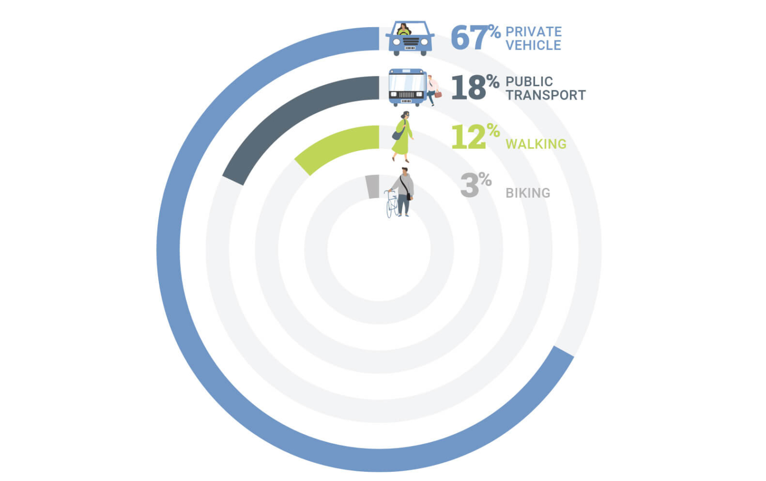
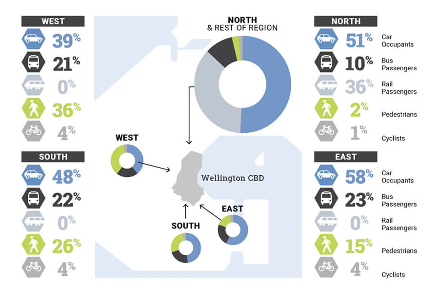
abstract map of wellington with pie charts and percentages showing travel types into the city

Pogo’s infographic showing travel into Wellington City for the Wellington Regional Growth Framework

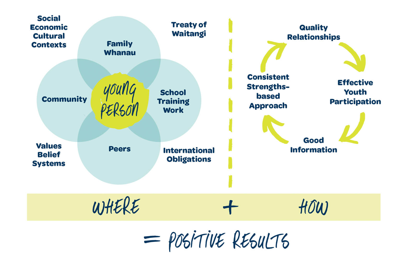
6) Diagrams

One of several diagrams describing different models in the ‘Alive and Well’ document designed for Upper Hutt City Council and Lumin.

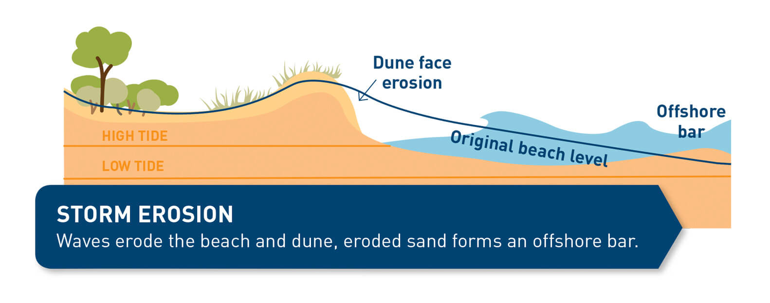
7) Illustrations

Illustration of a dune in profile

One of the illustration showing dune erosion in the brochure (by Pogo) for Kapiti Council City Council


Selling features and benefits

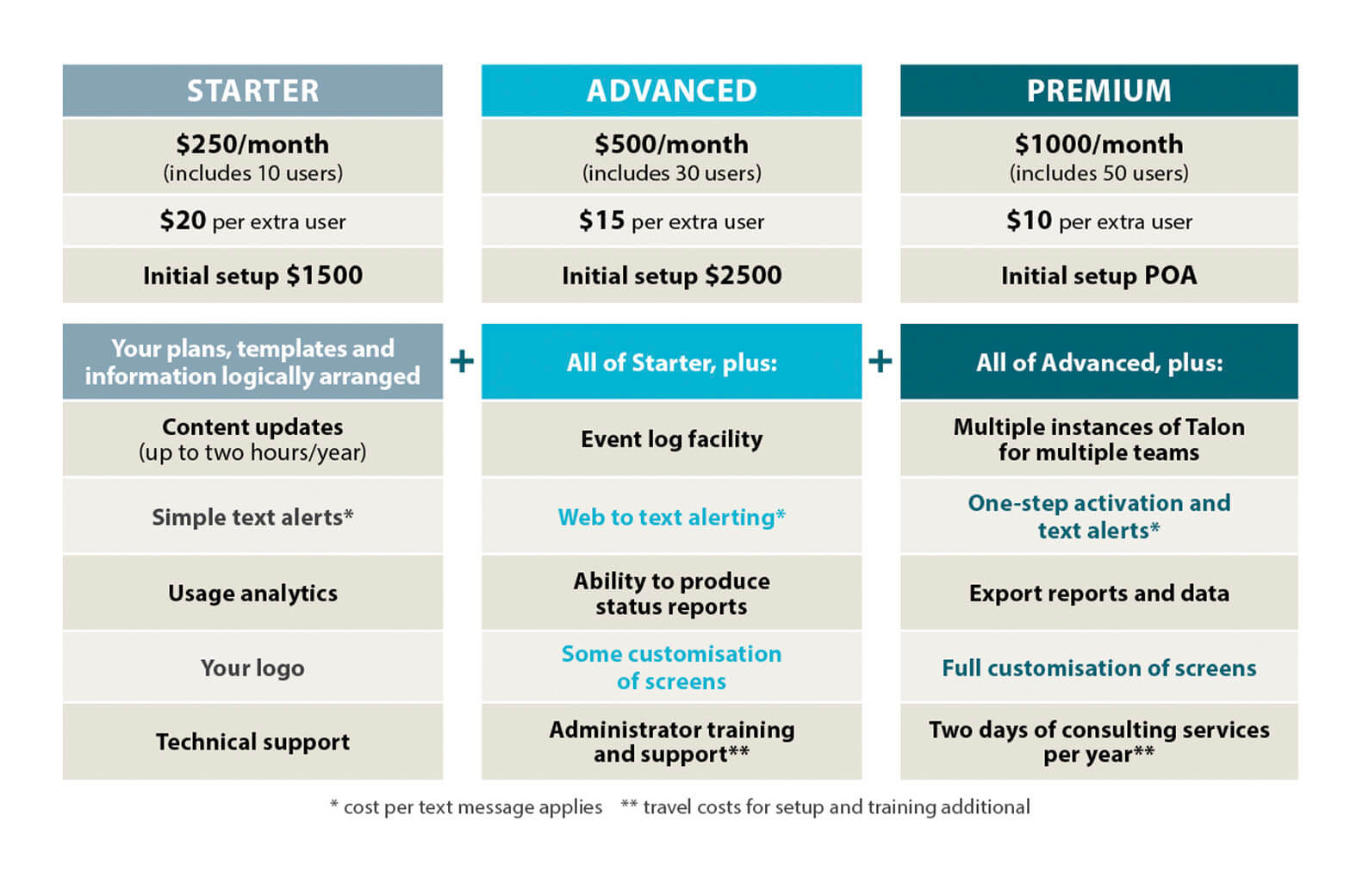
If you are a business selling products or services, differences can be distinguished by colour-coding or with benefits/features highlighted by icons. Using a table to compare costs, features and benefits is a popular and effective way for customers to decide which option they want.

table showing features and benefits of a product

Features and benefits table laid out for Kestrel Group.

Other things to consider

Getting through to your audience is paramount. Being more accessible and inclusive will help with this. I’m by no means an expert but areas to think about include:

  • People with visual disabilities and low vision
  • People with learning difficulties, including dyslexia etc
  • People with limited literacy
  • Different languages
  • Being inclusive with gender, ethnicities

The UK Home Office put together a set of accessibility posters which are great resource.

Check out the previous infographic blog here.

If you have any infographic questions, feel free to get in touch.


May 17, 2021
https://www.pogodesign.co.nz/wp-content/uploads/2021/03/BLOG-INFO-pie-poeple-01.jpg 993 1582 Jane Comben https://www.pogodesign.co.nz/wp-content/uploads/2024/06/UPDATE_POGO-LOGO-297x300.png Jane Comben2021-05-17 09:58:272021-05-17 10:15:12Infographics – making information more accessible (2/2)
Graphic Design, Helpful Information, infographics

Infographics – making information more accessible (1/2)

abstract map of wellington with pie charts and percentages showing travel types into the city

We live in an increasingly complex world and are bombarded with information 24/7. To have any chance of catching and holding a customer’s attention it helps to be very clear about what you want to say and present that information in an eye-catching or easy to digest form.

Infographics (or information graphics) is described by oxfordreference.com as “visual representations of data, information, or concepts.”


A recent article by The Guardian, about New Zealand’s clear messaging during the Covid-19 pandemic, highlights how important it is to have a clear communication strategy and how it is delivered.

“Information design may seem a superficial front by which to assess a pandemic response; but whatever course a government chooses to take against the virus – whether it be elimination, control or herd immunity – it is effective only insofar as people understand it.”

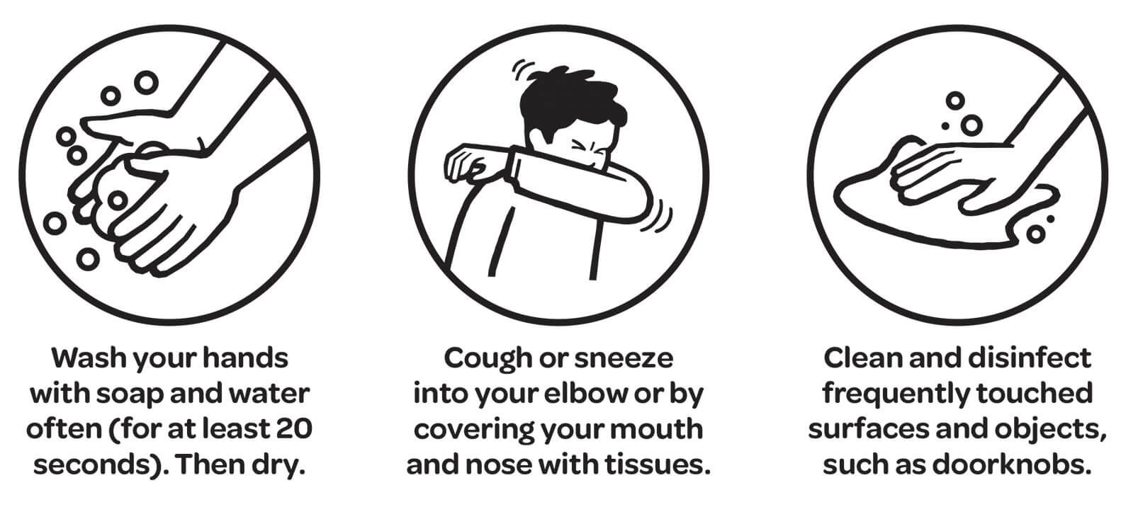
One example they reference is the use of simple black and white pictograms to illustrate public health directives, chosen for their inclusivity, compared to examples of less successful campaigns in other countries.


illustration of public health messages

‘Unite against Covid’ public health illustrations.

While most projects do not have the same pressing importance as a government’s pandemic response, using appropriate infographics will often help people understand the story you want to tell them.

Infographics can be divided into three basic types:

  • Data visualization (charts, graphs etc)
  • Information design (concepts or other information, such as process, anatomy, chronology, or hierarchy.)
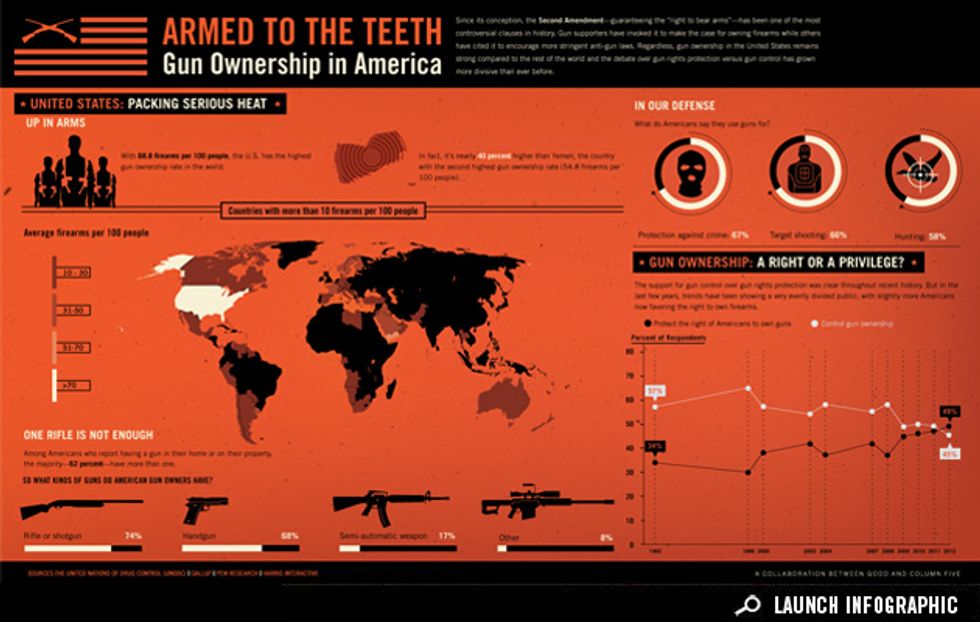
  • Editorial infographics (graphic content to replace more traditional editorial features)

Example of editorial infographic from www.good.is/infographics

Part two of this blog can be read here.

May 3, 2021
https://www.pogodesign.co.nz/wp-content/uploads/2021/05/BLOG-infographic-Kapiti.jpg 600 900 Jane Comben https://www.pogodesign.co.nz/wp-content/uploads/2024/06/UPDATE_POGO-LOGO-297x300.png Jane Comben2021-05-03 09:01:112021-05-17 09:18:10Infographics – making information more accessible (1/2)

Pages

  • About Pogo Design
  • Blog
  • Client testimonials
  • Contact Pogo Design
  • Design services
  • Home
  • Home
  • Portfolio
  • Privacy Policy
  • Resources
  • Visual Audit Checklist
  • What my clients say

Categories

  • Branding
  • Community
  • Creativity
  • Graphic Design
  • Helpful Information
  • infographics
  • Print Design

Archive

  • November 2025
  • October 2025
  • July 2024
  • April 2024
  • March 2023
  • February 2023
  • September 2022
  • July 2022
  • June 2022
  • May 2022
  • October 2021
  • July 2021
  • June 2021
  • May 2021
  • April 2021
  • March 2021
  • February 2021
  • November 2020
  • August 2020
  • July 2020
  • June 2020
  • April 2020

Get in touch

Pogo Design
021 136 1745

hello@pogodesign.co.nz

Porirua | Wellington | Kapiti Coast

Terms and Conditions

© Copyright 2017 Pogo Design | All Rights Reserved
  • Link to Facebook
  • Link to Instagram
  • Link to LinkedIn
Scroll to top Scroll to top Scroll to top
We use cookies to ensure that we give you the best experience on our website. If you continue to use this site we will assume that you are happy with it.