A lot of projects in the public sector require some element of community engagement or consultation.

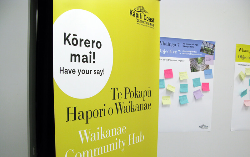
I worked with Kāpiti Coast District Council on their Waikanae Library and Community Hub community engagement. They wanted to find out what was important to people and which of three possible options the community preferred.

Here are five simple ideas we used in the Kapiti Coast District Council pop-up engagement centre.

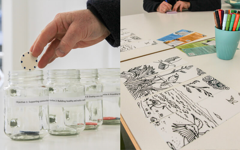
  1. Activities for all ages

    In the pop-up space there were option tokens, a council representative available for questions and colouring in supplies.

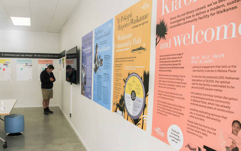
  2. Large format posters


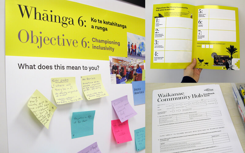
  3. Feedback options

    A large poster was created for each objective. Questions were posed and there was plenty of space for post it note comments. More feedback could also be provided in the summary document, on the hard copy feedback forms or online.

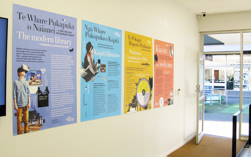
  4. Pull up banners


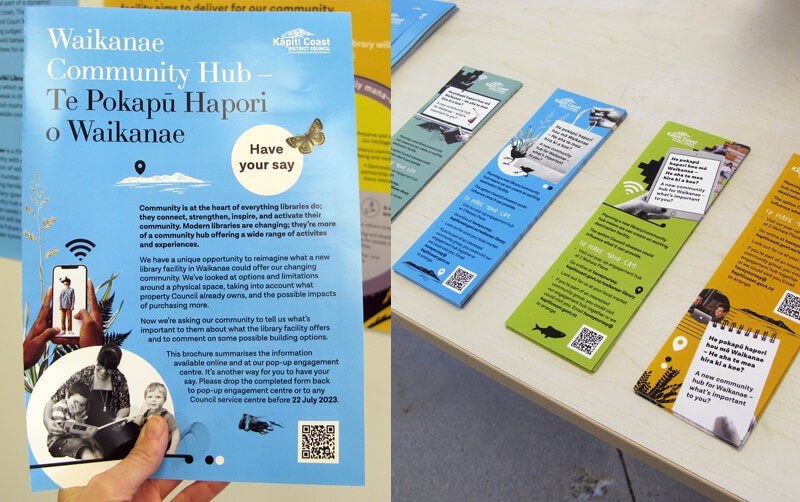
  5. Information to takeaway

    We created a summary brochure and bookmarks. Both included a QR code that linked to more information on the website with options to give feedback.

The community engagement was a real success with lots of people providing their view, opinions and comments.

One great feature was leaving post it note comments up for the duration of the engagement. This meant people could see and read others views and opinions. Which in turn generated discussion.

Kapiti Coast District Council agreed to the option selected by 50% of the respondents, and will refurbish the former library. The building will be developed into a modern library and community hub that will provide a warm and welcoming multi-functional space.

(Image credit: Kapiti Coast District Council)

Some years ago, I was involved in one of the first bilingual traffic signs in Aotearoa New Zealand for Porirua City Council. It got some media attention at the time and I’ve noticed that bilingual signage is becoming much more common.


Tree-lined suburban street with cars and a blue road sign with white words that read āta haere slow down

Porirua’s first bilingual road signs mark the streets around Takapuwahia Marae.


Some of the examples I’ve seen are council signage by Porirua City Council and Wellington City Council.


White pole with a blue sign against a bright blue sky

Porirua City Council signage in Pukerua Bay, Porirua.


Out of interest, I looked to see if there were any bilingual signage guidelines out there. I found that Te Puni Kōkiri, Ministry of Māori Development have put out a resource called ‘Māori-English Bilingual Signage. A guide for best practice’.

Their objective for developing the bilingual signage guidelines is to “Increase the visibility of te reo Māori in public spaces within the government (central and local) extending to business sectors, and thereby increase the usage of te reo Māori in every day conversation.”

They say when developing bilingual signage the key principles are:

  • Responsive and accessible services
  • Visibility of language
  • Equality of language
  • Quality of language

Te Puni Kōkiri says that embracing te reo Māori and culture in everyday public life helps establish a shared national identity and builds goodwill and social cohesion within Aotearoa New Zealand. That it’s a good business practice as it can help build staff pride, morale, and loyalty.


“Bilingual signage also offers the opportunity for organisational development through building staff capability to speak te reo Māori, and therefore their ability to work with Māori communities, and to communicate and negotiate with a range of customers in diverse situations.”


Te Puni Kōkiri’s guide is based on international literature and the United Nation’s best-practice principles of bilingual and multi-lingual language planning guidelines adopted in policies and guidelines in many countries. They say “the typographic rules applying to bilingual signage as an internationally recommended standard shows the “first language” (the one being revived), i.e.
the Māori text is at least as large as the font for the English text even if the text in one language is longer. Further, if this is not practical in terms of the eye easily reading at a glance, then the Māori text should dominate. The rationale is that English is an international language that most people know and understand. Customers will, therefore, have little difficulty in navigating themselves towards a building or within its work-spaces, or websites.”


“It makes sense to have the Māori on top; that’s how we keep the language alive.” DEPARTMENT OF INTERNAL AFFAIRS


Black panel painted on a white wall with the words wharepaku toilets and some toilet icons

Bilingual toilet signage in Arapaki Manners Library, Wellington City.


All great stuff but how exactly do we put that into practice? What does it look like?

Luckily TPK have distilled the main design points into a PDF.  I’ve listed their Do and Don’t points below.


Cream panel with various bilingual signs

Some tips taken from TPK’s “Design tips to support quality bilingual signage” PDF

Bilingual signage tips

DO:

  • Have the font for the Māori text at least as large as the font for the English, even if one text runs longer.
  • Use an equal typeface for the Māori and English.
  • Use the same font style for the Māori and English.
  • Apply colour coding to text and or language – separating background panel.
  • Be consistent in all signs with the same colour and position for each language.
  • Consider how a pictogram might reduce the amount of text required.
  • Place Māori first, either stacked or side by side.
  • If both Māori and English cannot be easily read because signage is ‘visibly biased’ consider having the Māori only.

DON’T:

  • Assign a heavier font or colour for English.
  • Apply a dominant visual style to English.
  • Use italics or symbols (– or /) to separate Māori and English.
  • Squash Māori to match English text.
  • Use CAPITALS to differentiate languages (e.g. CAPITALS and upper and lower case).
  • Double up on icons.

As always there is more to learn, and I look forward to putting these tips into practice.


Here are some of the resources I found that you might find useful:


Letter a with macron in different bright colours on a white background

Kia ora.

Te Reo Māori is the indigenous language of Aotearoa, New Zealand and one of three official languages of the nation. Its use is increasing in professional and everyday life. As a designer that means designing with fonts that can accommodate macrons as they are an integral part of the language.

I’m going to share some simple ways to find some macron enabled fonts to use in your designs.

I’ve made a quick video of some of the ways here.

Google Fonts

Google font homepage

This a great resource of all of the typefaces listed in the Google Fonts directory are open source. More info about the licence here.

On the home page you can add a word with macrons under ‘custom’ in the search bar. You can then see if the fonts available have macrons. Another option is to select ‘Latin Extended’ in the ‘Language’ button list. This should exclude most fonts that don’t have macrons.

Adobe Fonts (Typekit)

Screenshot of Adobe Font search window

If you’re using Creative Cloud you’ll know you can access Adobe Fonts. When searching in Adobe Fonts you can paste a word with macrons into the ‘Sample Text’ window. This will show a range of fonts and the ones that do not support macrons will have a crossed box replacing the macronised letters.

Screenshot of Indesign Glyph window

If you’re already in Indesign or Illustrator you can add or check whether the font you’re using has macrons by going to Window>Type>Glyphs and selecting ‘Entire Font’ in the ‘Select’ window. Scroll through to see if there are macrons. Double clicking on any of the letters will add them into a text box you have open.

Canva


screenshot of selecting different typefaces in Canva

If you’re using Canva, select a template or one of your existing designs. In a typebox paste a word containing a macron. With that typebox selected you can click on the typeface button in the top left of the editing banner which will open a window of different fonts. Most of the popular fonts accommodated macrons when I checked them. If they don’t there is a basic default font used.

It’s so great there are many macron enabled font options out there which makes it easier for designers to do the right thing! Here are a couple of other resources that I’ve also found useful.

Other useful resources:

Ka pai!

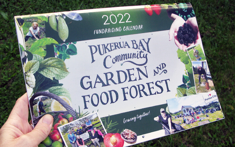
A hand holding a community garden fundraiser on a dark background.

In business, and in life, you’re often encouraged to consider your “Why”. This is the concept of having a purpose, belief or cause that is a driving force in what you do and how you do it. Simon Sinek describes the concept in this TED talk.

Like many simple ideas I found it easy to understand but much harder to define an answer for myself.

Over the years I’ve realised I get a sense of personal satisfaction and purpose from contributing to my local community and that I value community building. I’ve already talked about the benefits of this in a previous post.


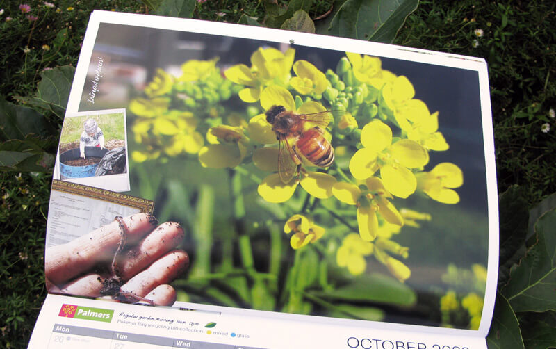
Open calendar showing a photo of a bee on yellow flowers

Last year my local community garden group created a  community garden fundraiser and I contributed my design skills – on the understanding I would not need to be involved in the selling!

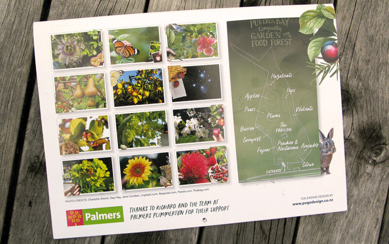
The project included photos, content and artwork from other collaborators (indio Anne) and support from our local Palmers Garden Centre and The Print Room.


Back of a calendar with a grid of photos showing the month images

It was a successful fundraiser and I enjoyed a creative project, the chance to play around with collage and experiment with making a promotional video in Canva.


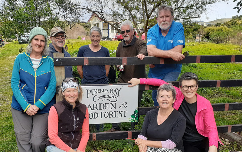
A group of smiling people positioned around a hand painted sign that reads Pukerua Bay Community Garden and Food forest

But, what does a sense of community look like in the way I do business?
A lot of what I do professionally is about connecting and building relationships. Things like:

  • Working with organisations and businesses that want to build and connect with communities and make a positive difference.
  • Contributing to many clients teams, often over years.
  • Collaborating with other complementary businesses (and co-authoring a book).
  • Supporting business groups such Chrysalis for Women (sharing my knowledge through presentations and as an Advisory Board Member).
  • Attending workshops and presentations such as the Creative HQ series.
  • Donating my time and skills to initiatives that resonate with me.

I’d love to hear what motivates you.

Three file icons on a pink background with a question mark on the front of each file

Every now and then I’m asked; “Did you work on this?”

Each time, I’m reminded that the extra bit of effort required to number, name and file a job properly is worth it for those occasions when I’ll need to retrieve it.

Recently, I was asked this question about a project that had lots of iterations over the years… including a company name change. I didn’t have the job number, but I did know the client and the project name.

With a quick bit of digging, I found all the artwork files in the cloud and on archived DVDs. Turns out they were from 2012, 2014 and 2015.

I’ve been working with this client for 14 years and most, if not all, the staff have moved on. I was delighted that my archive provided a kind of outsourced ‘institutional knowledge’ storage system.

With staff turnover and different filing systems, sometimes clients will ask me to source a logo or photo they’re having trouble locating in-house. Or sometimes a project is being reprinted or updated.

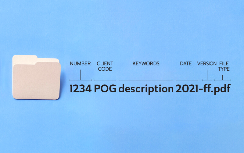
Diagram showing the different parts of a file name

Whatever the reason, my job number, client code, description/keyword and date filing system hasn’t let me down yet!


Different design projects require different colour systems depending on how they are being produced. In a brand guide for example, there will be usually be CMYK and RGB values for the different brand colours. What’s the difference between them and why do we need both?


CMYK is created with ink

A full range of colours are created by adding physical Cyan (bright blue) Yellow, Magenta (bright pink) and Black inks on white paper.
Any project that will be physically printed with ink rather than on a digital screen.

CMYK values range between 0 – 100.
No covering of ink = 0
100% covered of ink = 100


Black (completely covered in ink) has a value of:

C: 100

M: 100

Y:100

K:100


While white (no ink) has a value of:

C: 0

M: 0

Y:0

K:0


Please note: There is a minimum and maximum value of ink coverage for the best printing result. General guidelines are not going below 10% for minimum ink coverage or over 280 -300% for maximum ink coverage but will depend on the type of paper or ‘stock’ being used.

Some colours can’t be reproduced using the CMYK system (such as fluorescent orange or reflex blue) . Another option is a“spot colour “ using special inks in the Pantone colour matching system.


RGB is created with light

Starting with a black digital screen Red, Green and Blue light are added to create colour.
Anything that is created electronically for a digital screen uses RGB colour.

RGB values have a range between 0 – 255 for each colour denoting the amount of light added.


Black (no light) for example, has a RGB value of:

R: 0

G: 0

B: 0


Whereas white (maximum light) has the highest value for red, green and blue lights, creating white.

R: 255

G: 255

B: 255


Please note: Some colours that look bright and vibrant on screen are hard to recreate physically with CMYK ink. Especially bright orange and some light turquoise blues.

Feel free to get in touch if you have any colour queries.

Pages from an open report on a grey background

Factors driving a public sector design project can be quite different to those in the corporate or business world.

This is because:

  • of accountability to rate payers and tax payers
  • projects are often community-based and grassroots which can require accessible design and different languages
  • it’s about communicating information rather than driving sales
  • things take time to get through the approvals and sign-off processes
  • projects can be political and perceptions may influence design decisions.
Page from a document showing pull out quotes

Feedback quotes from consultation participants shown in Porirua Development/Kāinga Ora’s Community Engagement Report.


There’s a lot of design staples in the public sector – here are three types I most commonly work on.

  • Regulatory documents like Annual Reports and Statements of Intent
    These usually are published within a prescribed timeframe and have to contain specific information. But as far as design is concerned, and certainly in the front half of these documents, there’s room to reflect the organisations character and reflect its values. I’ve written a blog about ‘The anatomy of an annual report’ which has some more information and design tips on how to make it look great!
Cover and inside page of an A4 document shown on a grey background

Wellington Water’s Annual Report designed within their existing brand guidelines.

Document Design Wellington

Pages from Wellington Water’s Statement of Intent.


  • Infographics
    A picture tells a thousand words – and that’s the role of the infographic. Maps, graphs, charts, diagrams, icons, illustrations, pull-out quotes and numbers are all great ways to help make often complicated information more digestible. The ‘Wellington Regional Growth Framework’ is packed with facts and figures and uses lots of different types of maps, diagrams and schematic to demonstrate them. (https://wrgf.co.nz/reports/)

Pages from the ‘Wellington Regional Growth Framework’ Foundation Report showing demographic statistics through graphs.

Pages from the ‘Wellington Regional Growth Framework’ Foundation Report showing access to opportunities.


  • Promotional work including posters, invites and social media tiles
    Consultation is often required and many projects I’ve worked on have a community consultation component, often involving open days or events. Designs work better when they consider the neighbourhood and the communities within it. Printed posters and physical invites /flyers often compliment social media promotions. Maps or diagrams often feature to explain the options being proposed and to prompt comment and feedback.
Invite showing a photo of a child riding a bike

Invite to a safer cycling community working hosted by Kapiti Coast District Council using their brand guidelines.


Facebook Event image

Facebook event banner for a community event.


Kapiti Coast Map Design

A map used in public consultation about speed limit changes proposed for Kapiti Coast District Council roads.


Usually local government, council controlled organisations and other public sector organisations have established brands. I can provide both brand strategy advice or be a virtual “in-house” designer and custodian of existing brand guidelines. My well organised document management system means I can easily retrieve that job we worked on five years ago so we don’t have to start from scratch for a similar project.

If you have any public sector design questions, feel free to get in touch.

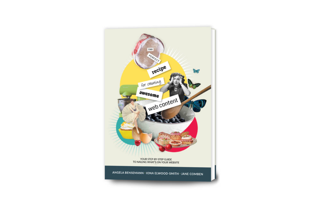
As mentioned in my recent blog I’ve recently become involved in a project to co-author The perfect recipe for creating awesome web content. As the title suggests it’s a book about writing content for small business websites. Angela Bensemann and Iona Elwood-Smith approached me to contribute to their project. What started out as just a cover design became a larger undertaking.

While I’m experienced in document design I’ve never worked on a book before. We decided to concentrate on a physical book in an easy-to-hold size (6 x 9 inches or 152 x 229mm), an A4 downloadable PDF version and some bonus A4 PDF worksheets. Unrestricted by epub limitations of an ebook I let my creative hair down and came up with illustrated section breaks, pull-out boxes illustrated with photos and engaging worksheets.

Colourful collage illustration showing a smiling woman, cake and bird

This collage uses free stock images from Rawpixel.com and Unsplash.com

Here are ten of the conventions and elements that I came across while preparing the book for print (some details new to me!):

  1. Cover and Title Page: The title page is often the first right hand side page inside a book and shows the title, author and publisher.
  2. Copyright page: This follows the title page and includes information on the author/s, copyright, publisher, ISBN number (more on this in point 6) and can include design details.
  3. Dedication: A chance to make your mum proud!
  4. Numbering: Odd numbers are always on the right-hand page.
  5. Section heads: Not common in fiction but as this was a non-fiction “how to” title it made sense to go to town with the full colour printing and create fun collage illustrations for each section.
  6. ISBN number: This is a unique International Standard Books Number which in New Zealand is issued by the National Library for free. We found we needed to decide which formats we wanted to produce (hard copy, soft copy, epub etc) and apply within eight weeks of publication. More details are here ((https://natlib.govt.nz/forms/isn))
  7. Barcode: If you’re selling in a retail setting, you’ll need a barcode. There are various types and you’ll need your ISBN number. We took advice from our author friend, Susan Holt, and purchased an EPS file from the Label Shop which I added to the back cover design.
  8. Spine: Don’t forget the spine design. Wording usually runs from the top of the book down. The size of your spine will depend on your page count, the type of paper used, and the type of binding used. Your printer will be able to advise you. We used the handy spine calculator on the Your Books website. This also allowed us to include other measurements to calculate the final cover size of the cover artwork (including the front cover, spine and back cover).
  9. Printing specs: How your book is printed will have an impact on your book design. In our case we chose a digital full colour cover with a matt laminate (the advice was ‘it’s not a romance novel so you don’t need a gloss cover’!) while the inside uses a highspeed inkjet process. As the cost was similar we opted for colour over black and white. It was late in the day that I learnt the inkjet process has limitations compared to normal digital or offset printing. Apparently inkjet printing works better with small areas of bright colours. Not the large areas of paler shades I’d designed. Luckily, we opted for a printed proof which allowed us to check out which design elements would work or need to be tweaked to suit the printing process.
  10. Photography: A professional author photograph will help you look the business! We had a full photoshoot with Juliet Watterson Photographer so we could get some good shots of the authors for the book and also for our Collaboration Station website and social media sites. The photographer is often credited on the copyright page, next to the author photo or back page. Reference to the source of stock images used in the cover art may also be mentioned.
Head and shoulders shot of a woman smiling

Author photograph by Juliet Watterson Photographer (www.julietphotographer.co.nz)

I’ve heard it said that writing a book is only half the job, with printing, marketing and distributing being the other. There is nothing like a final printer’s proof to focus attention on the job at hand. A book, and all the jobs I’m ever involved with, will always benefit from a fresh pair of eyes to check for hidden spelling mistakes, funny spaces and any other inconsistencies. Luckily for us our helper spotted a couple of things that we were able to update before hitting the “approved, ready for print” button.

I hope these tips will help if you’re considering producing a book.


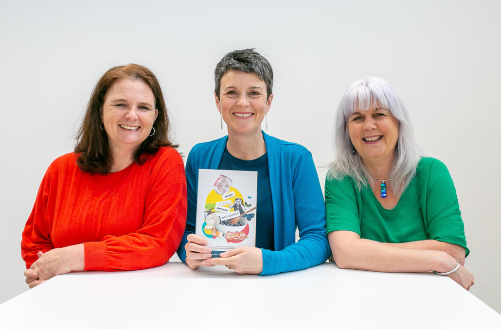
3 smiling women sat at a white table. The middle woman is holding a book.

It’s a cliché but I believe we do business with people we know and like. As a small business I focus on building relationships with others that have complimentary skills and I enjoy working with. But I never imagined I’d be co-authoring “The perfect recipe for creating awesome web content” book this year!

I’ve worked with Angela Bensemann from Halo Communications for over a decade and have been involved in several projects that also included website strategist Iona Elwood-Smith from Grow My Business. So, when Ange and Iona asked if I’d like to contribute to a project they were working on I was keen (even before I heard the details). What started out as just designing a cover for a book they were creating turned into something much more.

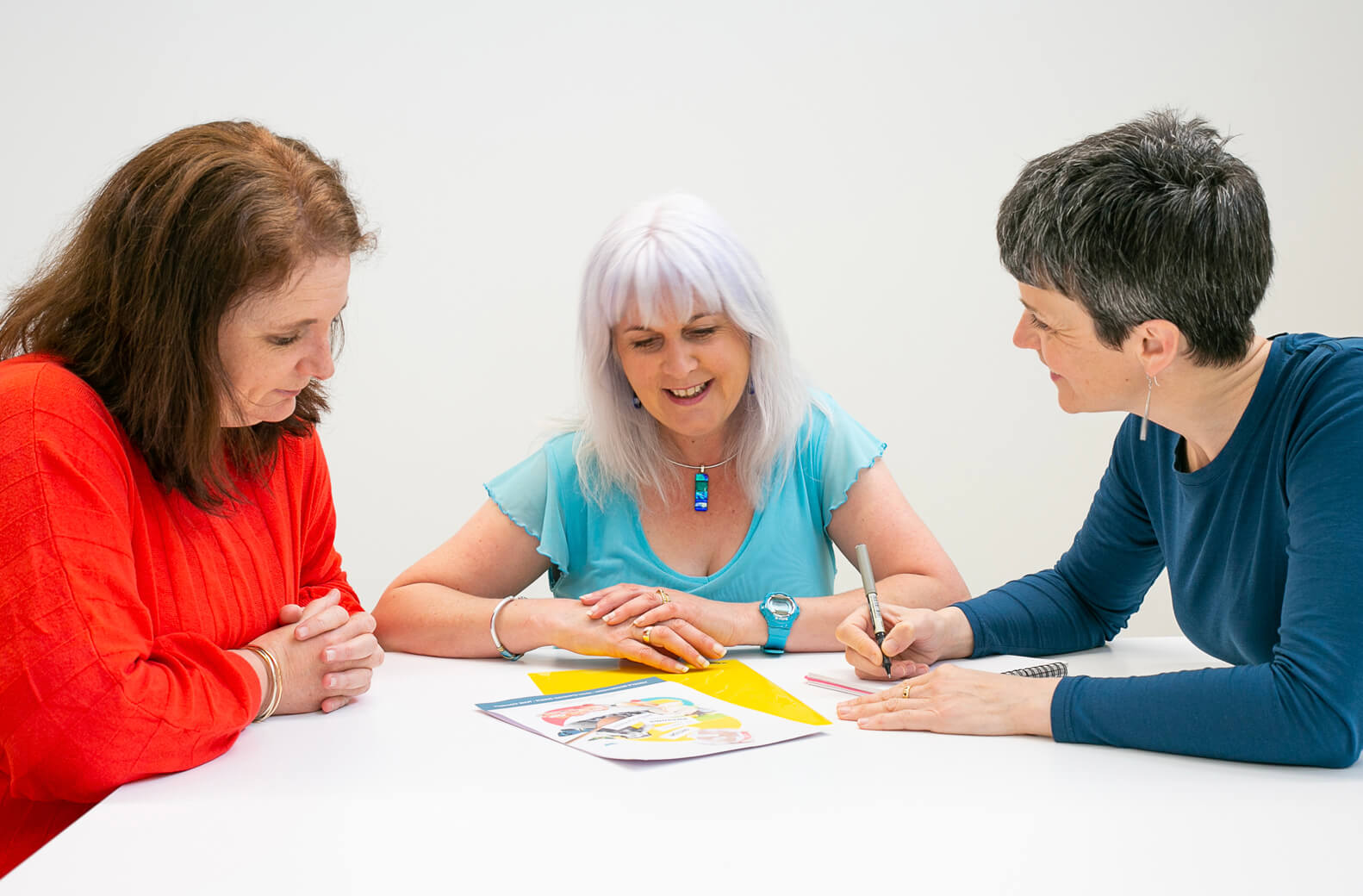
2 women sat at a white table lworking together

During the web projects Ange and Iona worked on together, they noticed that people find providing content a real sticking point during the website building process for their businesses. By pooling their respective expertise they could create a valuable “how to” guide ideal for small businesses and start-ups.

They had the writing, strategic and technical aspects covered, and some branding information would be good… as would a nicely designed book cover. Cue Pogo Design.

As the book developed we decided there might be more joint projects on the horizon as we often worked together anyway and that Collaboration Station would be a good home for our collaboration. As with any good team, the whole is greater than the sum of its parts. Or as Iona says “How cool is collaboration? Someone else does the bits I don’t like!”  We know it’s more fun working together, throwing around ideas and coming up with something new.

“How cool is collaboration? Someone else does the bits I don’t like!”

So, I’ve brought my graphic design and brand expertise to the party. It’s also been a chance for me to get creative and experiment with collage illustrations, art direct an enjoyable photo shoot and develop social media marketing resources. As well as building on my experience of document design and learning some of the conventions of book design. I share some tips I picked up in this blog.

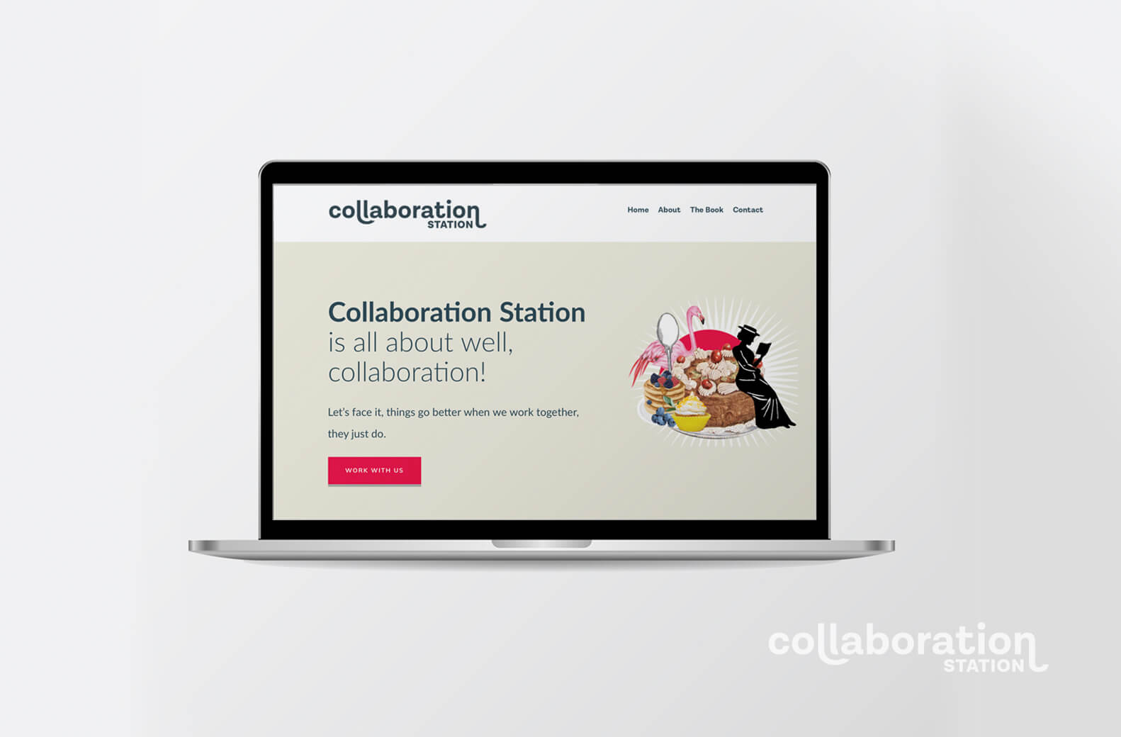
Open laptop showing a home page on the screen

You can pre-order our book and check us out at www.collaborationstation.co.nz or follow our journey on Facebookand Instagram . Who knows what we’ll come up with next?

While there are no absolute rules, there are some common practices for numbering a document that will be physically printed.

1) Position of odd and even page numbering

Start the numbering on a right-hand page so odd numbers (1,3,5…) always fall on the right-hand page of a spread and even numbers (2,4,6…) are always on the left.

2) Not numbering the Cover and front pages

The Cover and some initial content such as a Forward, Dedication and Copyright page appear before the main content. The Cover (and Back Cover) isn’t numbered and other initial pages are traditionally labelled with small Roman numerals (i, ii, ii, iv…) or not at all.

3) Blank pages don’t need numbers

Sometimes blank pages are added in the main content of a document for design purposes, such as allowing a section to start on a right-hand page. These pages are still in the numbering sequence but the number isn’t printed. For example, page 11 and page 13 have written content but page 12 in the middle of them is left blank. Page 12 is still counted but the page number isn’t printed. Blank pages may be added at the end of a document to make up the page count. All printed documents need to have a page count divisible by four because documents are created by folding paper in half to create 4 pages.

4) Position of page numbers

Avoid placing page numbers on the inside margin of a page, or too close to the outer edge (where they might get trimmed off). Usually page numbers are placed in the bottom right and bottom left of a spread. For design purposes they could also be centred at the top or bottom of a page, placed in the top right and left corner or centred on the outer left and right sides. Consider your audience and what sort of document you are producing when placing your page numbers. If your document is large and your audience will need to navigate back and forth through the document to find specific information make your page numbering easy to read and find.

If you have any page numbering questions, feel free to get in touch.