• Link to Facebook
  • Link to Instagram
  • Link to LinkedIn
Ph: 021 136 1745 / hello@pogodesign.co.nz
Pogo Design
  • Home
  • About Pogo
  • What I do
  • What my clients say
  • Portfolio
  • Resources
  • Blog
  • Get in touch
  • Click to open the search input field Click to open the search input field Search
  • Menu Menu
Graphic Design, Helpful Information, infographics

Infographics – making information more accessible (2/2)
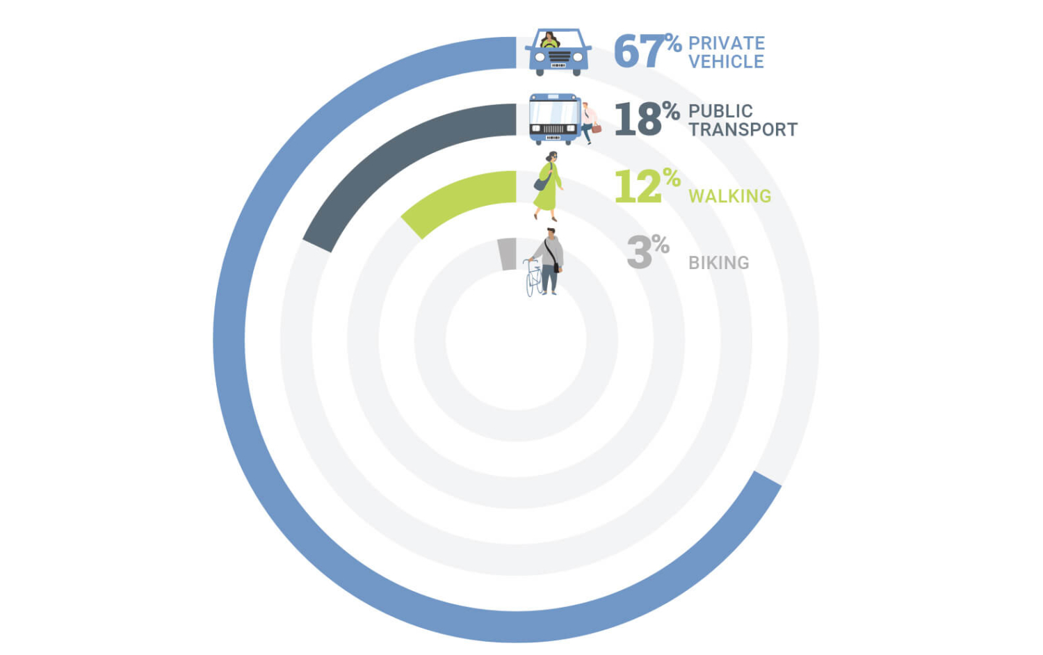
pie chart showing illustrations and percentages of different types of travelwww.pogodesign.co.nz

Communicating information rather than driving sales

What if your aim is to impart information to an audience that isn’t particularly engaged? Or the data is technical, complicated or copious? The answer is often to simplify where possible and cherry-pick the most pertinent or surprising facts.

In a previous blog I talked about the quirks of designing for the public sector  and that the challenge of making information easier to ‘take in’ and comprehend is something I deal with a lot. Here are some approaches that I’ve used to highlight facts or tell a story:

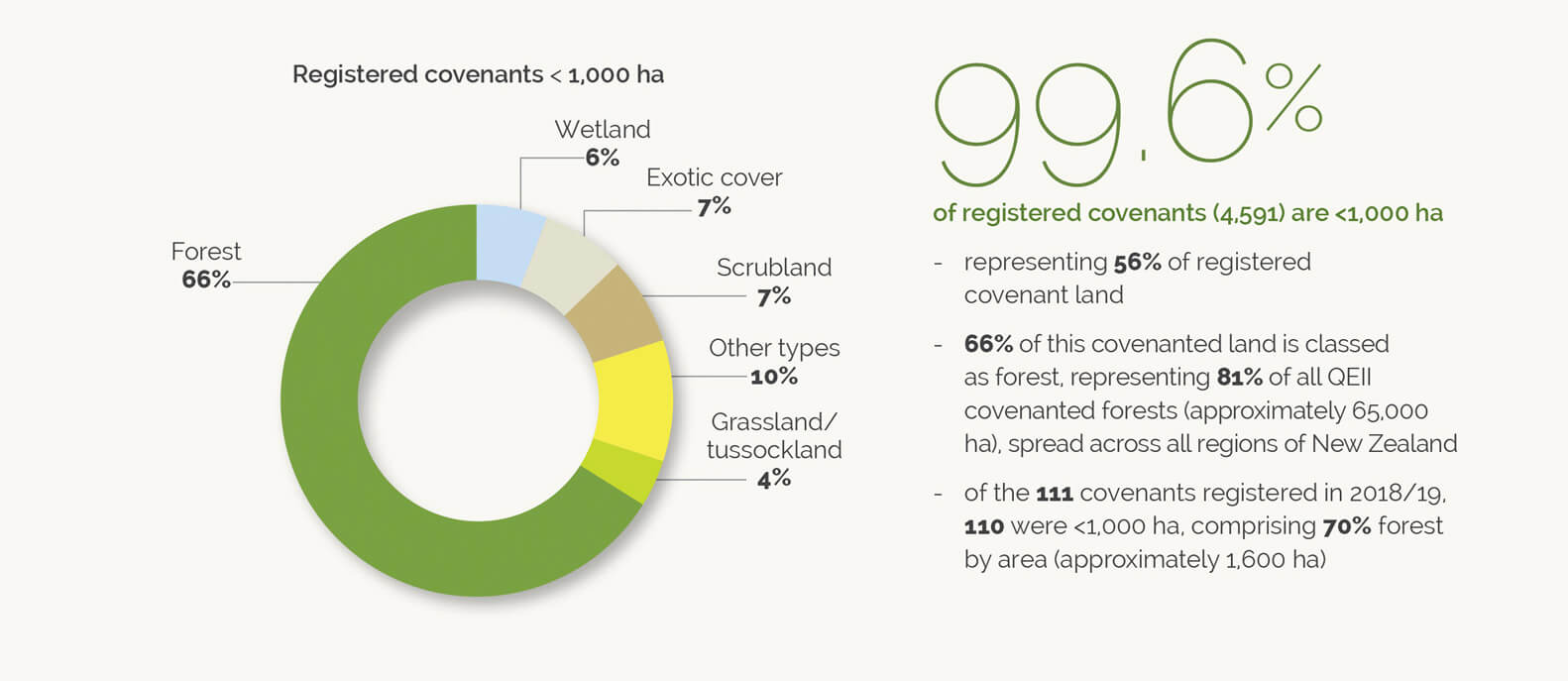
1) Pull out percentages and enlarge for visual impact
pie chart

A pie chart and pull out percentage from the QEII Annual Report, designed by Pogo based on their existing brand guidelines.


2) Multiple symbols to represent quantities

A snippet from Pogo’s Annual Report for Capacity.


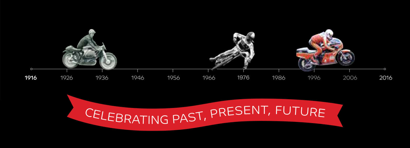
3) Timeline
timeline showing photos of different types of motorbike

TImeline to celebrate 100 years of Motorcycling New Zealand by Pogo.


4) Maps
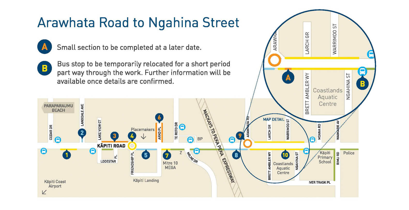
Road upgrades on Kapiti Road were shown on this map design by Pogo for Kapiti Coast District Council


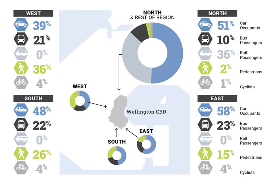
5) Icons/pictograms
abstract map of wellington with pie charts and percentages showing travel types into the city

Pogo’s infographic showing travel into Wellington City for the Wellington Regional Growth Framework

6) Diagrams
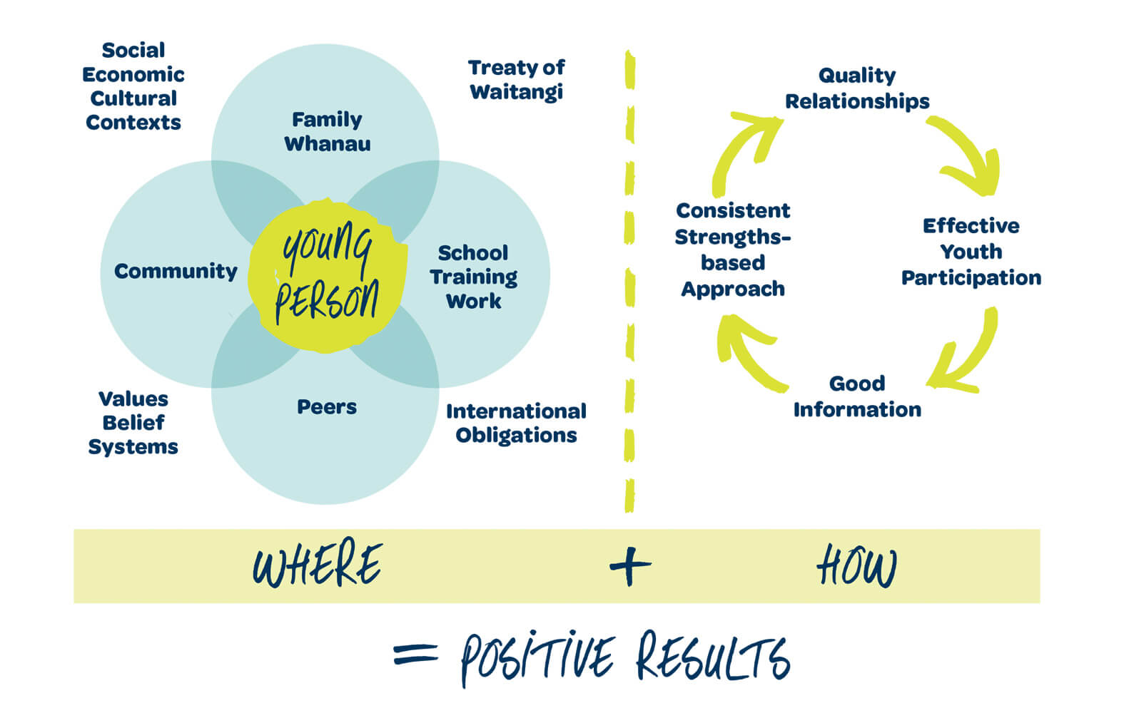
One of several diagrams describing different models in the ‘Alive and Well’ document designed for Upper Hutt City Council and Lumin.

7) Illustrations
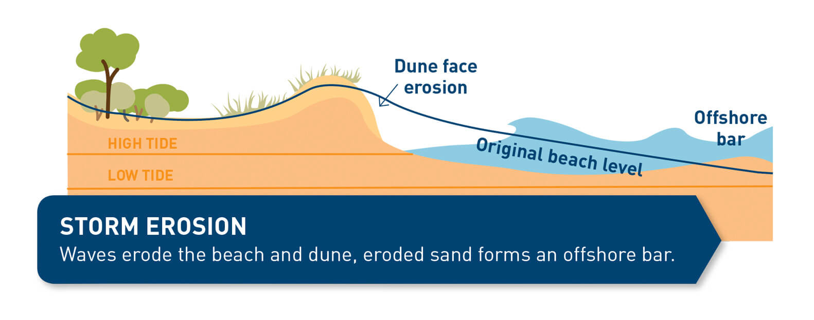
Illustration of a dune in profile

One of the illustration showing dune erosion in the brochure (by Pogo) for Kapiti Council City Council


Selling features and benefits

If you are a business selling products or services, differences can be distinguished by colour-coding or with benefits/features highlighted by icons. Using a table to compare costs, features and benefits is a popular and effective way for customers to decide which option they want.
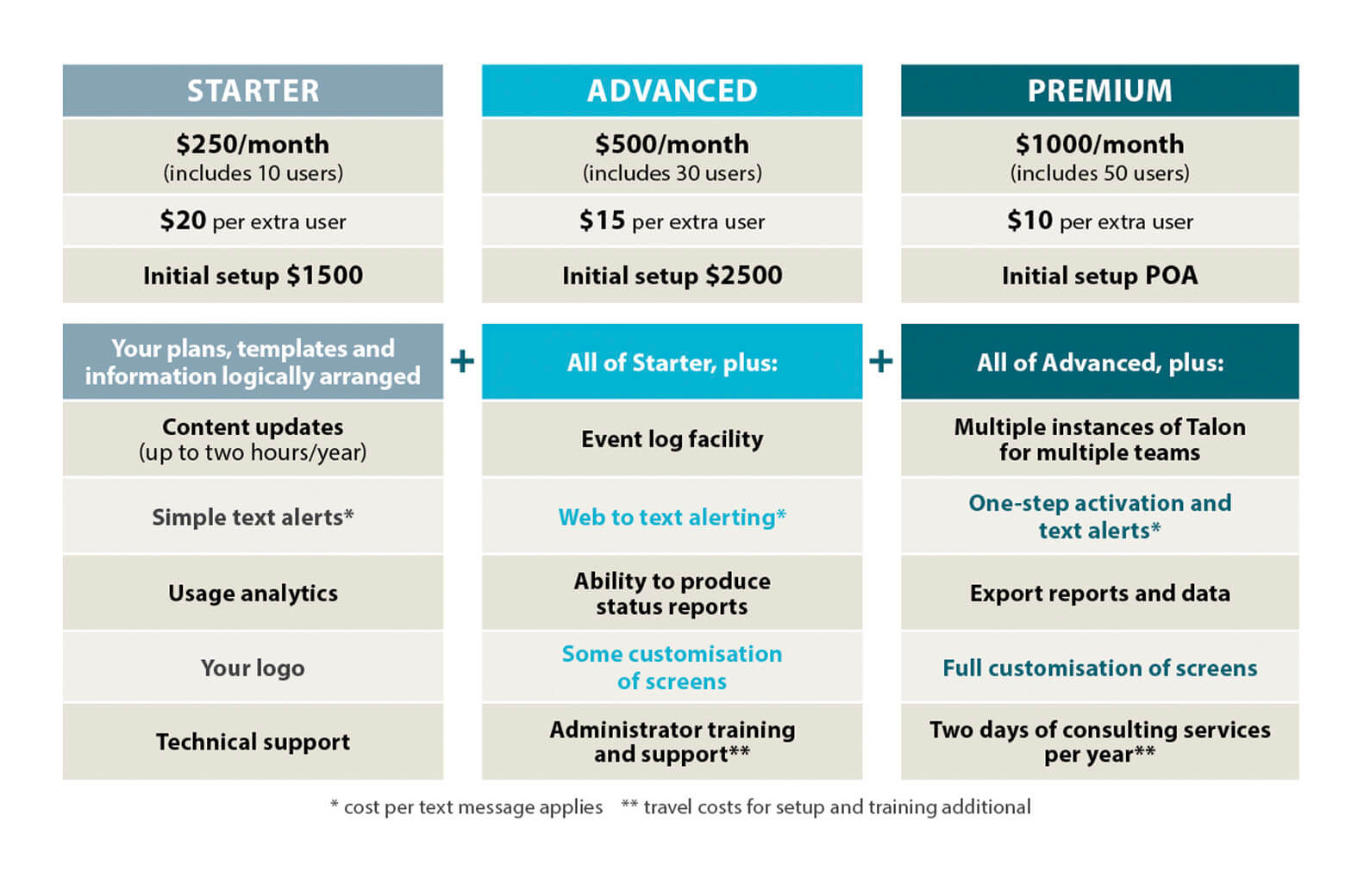
table showing features and benefits of a product

Features and benefits table laid out for Kestrel Group.

Other things to consider

Getting through to your audience is paramount. Being more accessible and inclusive will help with this. I’m by no means an expert but areas to think about include:

  • People with visual disabilities and low vision
  • People with learning difficulties, including dyslexia etc
  • People with limited literacy
  • Different languages
  • Being inclusive with gender, ethnicities

The UK Home Office put together a set of accessibility posters which are great resource.

Check out the previous infographic blog here.

If you have any infographic questions, feel free to get in touch.



May 17, 2021
Share this entry
  • Share on Facebook
  • Share by Mail
https://www.pogodesign.co.nz/wp-content/uploads/2021/03/BLOG-INFO-pie-poeple-01.jpg 993 1582 Jane Comben https://www.pogodesign.co.nz/wp-content/uploads/2024/06/UPDATE_POGO-LOGO-297x300.png Jane Comben2021-05-17 09:58:272021-05-17 10:15:12Infographics – making information more accessible (2/2)
You might also like
https://truestock.co.nz/mother-and-kids-jumping-on-trampoline/TS562716 Where to find authentic New Zealand stock photography
Colour illustration of a prawn Stock Images: same, same but different
A hand holding colourful paper shopping bags on a white backgroundPhoto by Karolina Grabowska from Pexels How does colour influence your customers and sales?
Large format display sizes compared to a human silhouette Large format display sizes
Colour: CMYK vs RGB
Jane smiling standing at a gate with a hand painted sign that says Pukerua Bay Community Garden and Food Forest Building a sense of community
5 simple way to engage with your community
Pexels.com Anatomy of an annual report

Latest posts

  • Wishing you a very Kiwi Christmas!November 26, 2025 - 5:07 pm
  • Welcome to Pogo DesignPogo Design
    Welcome to Pogo designOctober 21, 2025 - 1:03 pm
  • list of services
    A-Z of my servicesJuly 8, 2024 - 9:00 am
  • 5 simple way to engage with your communityApril 29, 2024 - 10:10 am

Categories

  • Branding
  • Community
  • Creativity
  • Graphic Design
  • Helpful Information
  • infographics
  • Print Design

Archives

  • November 2025
  • October 2025
  • July 2024
  • April 2024
  • March 2023
  • February 2023
  • September 2022
  • July 2022
  • June 2022
  • May 2022
  • October 2021
  • July 2021
  • June 2021
  • May 2021
  • April 2021
  • March 2021
  • February 2021
  • November 2020
  • August 2020
  • July 2020
  • June 2020
  • April 2020
Search Search

Get in touch

Pogo Design
021 136 1745

hello@pogodesign.co.nz

Porirua | Wellington | Kapiti Coast

Terms and Conditions

© Copyright 2017 Pogo Design | All Rights Reserved
  • Link to Facebook
  • Link to Instagram
  • Link to LinkedIn
Link to: Building your brand in a changed world Link to: Building your brand in a changed world Building your brand in a changed world Link to: Wishing you a very Kiwi Christmas! Link to: Wishing you a very Kiwi Christmas! Wishing you a very Kiwi Christmas!
Scroll to top Scroll to top Scroll to top
We use cookies to ensure that we give you the best experience on our website. If you continue to use this site we will assume that you are happy with it.