Infographics – making information more accessible (1/2)
We live in an increasingly complex world and are bombarded with information 24/7. To have any chance of catching and holding a customer’s attention it helps to be very clear about what you want to say and present that information in an eye-catching or easy to digest form.
Infographics (or information graphics) is described by oxfordreference.com as “visual representations of data, information, or concepts.”
A recent article by The Guardian, about New Zealand’s clear messaging during the Covid-19 pandemic, highlights how important it is to have a clear communication strategy and how it is delivered.
“Information design may seem a superficial front by which to assess a pandemic response; but whatever course a government chooses to take against the virus – whether it be elimination, control or herd immunity – it is effective only insofar as people understand it.”
One example they reference is the use of simple black and white pictograms to illustrate public health directives, chosen for their inclusivity, compared to examples of less successful campaigns in other countries.
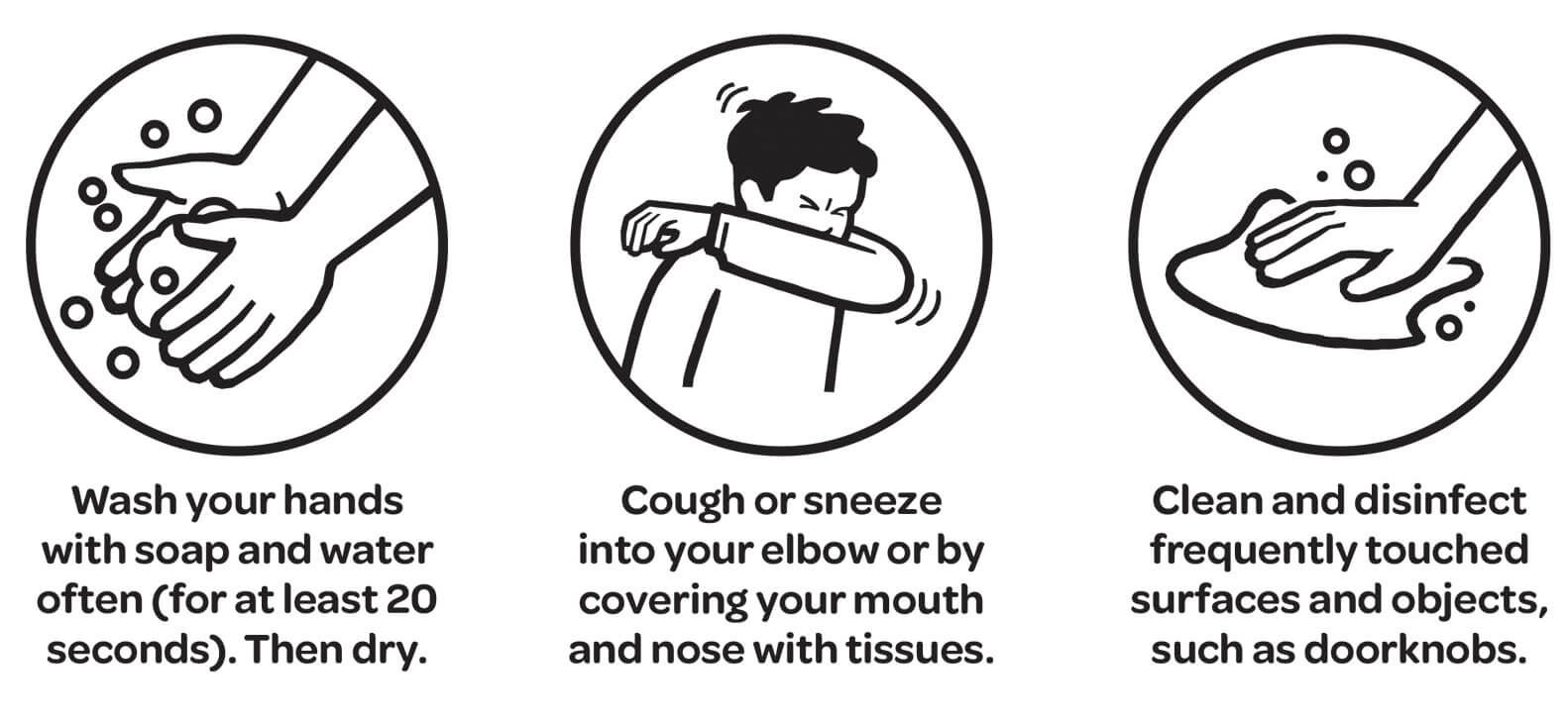
‘Unite against Covid’ public health illustrations.
While most projects do not have the same pressing importance as a government’s pandemic response, using appropriate infographics will often help people understand the story you want to tell them.
Infographics can be divided into three basic types:
- Data visualization (charts, graphs etc)
- Information design (concepts or other information, such as process, anatomy, chronology, or hierarchy.)
- Editorial infographics (graphic content to replace more traditional editorial features)
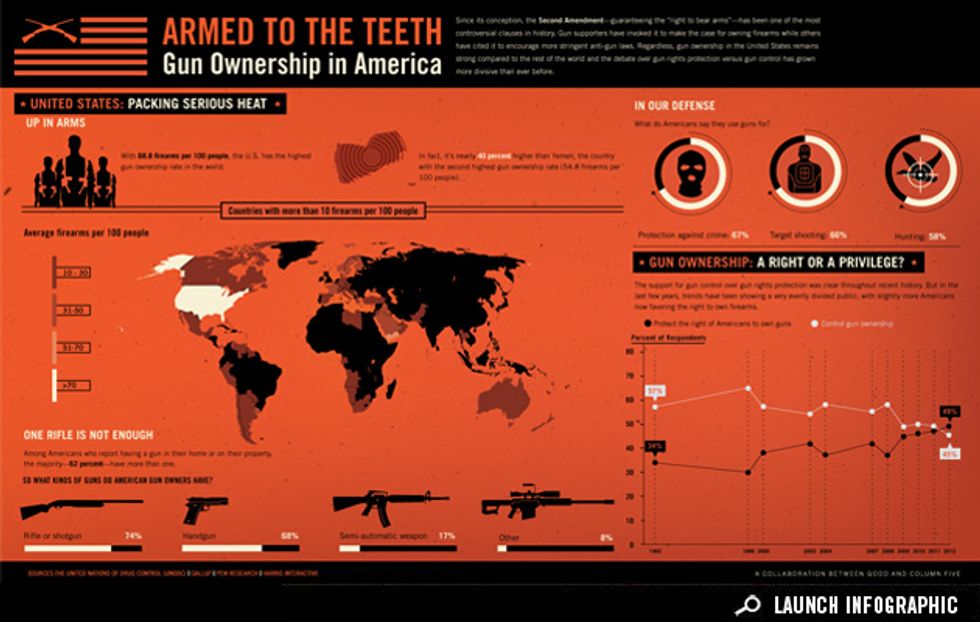
Example of editorial infographic from www.good.is/infographics
Part two of this blog can be read here.


 image from RawPixel.com
 Pexels.com
 Johny vino, Pierpaolo Riondato, Nadine Shaabana, Eckhard Hoehmann on Unsplash
 www.pogodesign.co.nz

 www.pogodesign.co.nz