
How does colour influence your customers and sales?
 Photo by Karolina Grabowska from Pexels
We’re all human, and it seems emotion and unconscious thought is what really drives decision making, and by extension our spending choices. Colour is an emotional cue and has a major effect on buying behaviour.
How does colour influence emotion and by extension your customers and sales? I look at:
- Psychology of colour
- Unconscious decision making
- Colour in branding
Colour psychology is a good place to start.
Wikipedia describes colour psychology as the study of hues (colours) on human behaviour. While the influence of colour on individuals can be subjective and may be affected by culture, gender and age, some aspects are considered more universal.
You’re probably already familiar with some broad categories of colour psychology.
 Warm colours, including red orange and yellow, evoke emotions ranging from feelings of sunny warmth and comfort to more passionate feelings of anger and aggression.
While cool colours, like blue, purple and green could be described as calm, secure and tranquil but can also feel cold and sad.
Colour can affect mood and therefore change shopping habits.
“Selecting the right colours to use has an enormous impact on product sales.” (J Suresh Kumar). One high street example of this is the prevalence of red and yellow in the logos of popular fast food chains. Also known as the ketchup and mustard theory; that red and yellow are a combination of colours that encourage us to eat.
Think about the advertising panels and logos of McDonald’s, Burger King, KFC, Wendy’s and Pizza Hut. Their logo colours would suggest they all strongly subscribe to the ketchup and mustard theory.
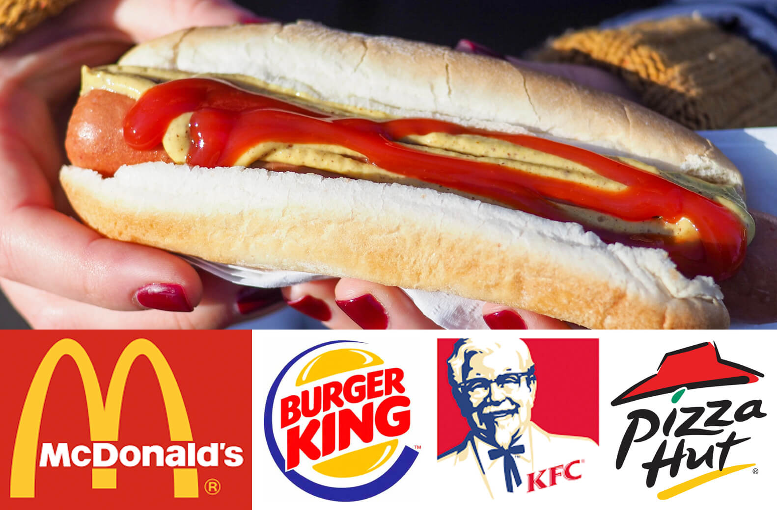
Hotdog Photo by Peter Secan on Unsplash
Unconscious decision making
Probably 95% of all cognition, all the thinking that drives our decisions and behaviours, occurs unconsciously—and that includes consumer decisions. That’s not to say that the 5% we’re privy to is unimportant—just that marketers overemphasize its importance, because it’s so visible and easy to access. (Harvard Business School professor, Gerald Zaltman)
If humans aren’t as logical as they think they are, and colour can suggest certain emotions it makes sense that colour can be a powerful marketing weapon. While showing rational features and services remain important tapping into an emotional response can get results.
“As the old saying goes – sell the sizzle, not the steak.”
Colour in branding
“When brands effectively reach customers on an emotional level, this deeper relationship builds the foundation of brand awareness and can even change shopper habits.” Branding is about making connections to your ideal customers and building a relationship that will affect their buying decisions. Creating a resonance between what you offer and what your customer wants or needs.
Colour is a key part of branding, and colour psychology can be a great help. You need only need to look at how popular blue is for Fortune 500 companies logos. But, let this be tempered by your particular ideal client. Their cultural or social background may change what resonates for them.
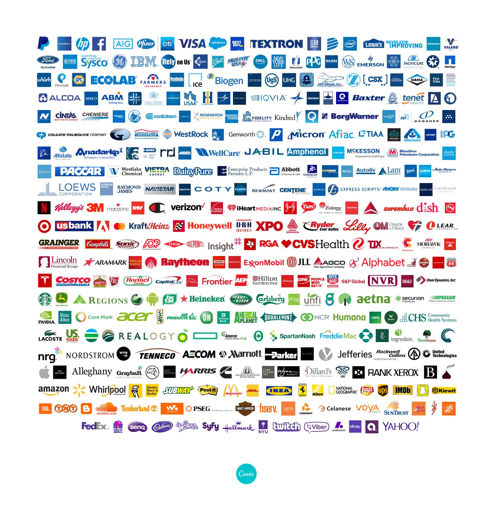
www.canva.com/learn/color-psychology-the-logo-color-tricks-used-by-top-companies
Pink may be associated with women’s products in general but it could easily be a turn-off for the specific women you want to appeal to.
How we present our businesses or products should resonate with our ideal customers and a good branding exercise will think about colour alongside:
- What you do (products, services, features)
- Your background/story
- Your competition/market
- Your key messages (Benefits to your client, values)
- Personality, words and voice
- Typography and Imagery
If you’d like more information about colour and branding please get in touch.
References:
- www.verywellmind.com/color-psychology-2795824
- The Psychology of Colour Influences Consumers’ Buying Behaviour – A Diagnostic Study. J Suresh Kumar, Ushus-Journal of Business Management
- www.marketingmind.in/know-fast-food-logos-red-yellow
- www.inc.com quoting Harvard Business School professor, Gerald Zaltman
https://hbswk.hbs.edu/item/the-subconscious-mind-of-the-consumer-and-how-to-reach-it - https://insightsinmarketing.com/resources/infographics/how-does-color-affect-consumer-behavior/)

 Pexels.com

 image from RawPixel.com
 Satya Priyomarsono
 www.pogodesign.co.nz
