
Growth in bilingual signage
 Pogo Design
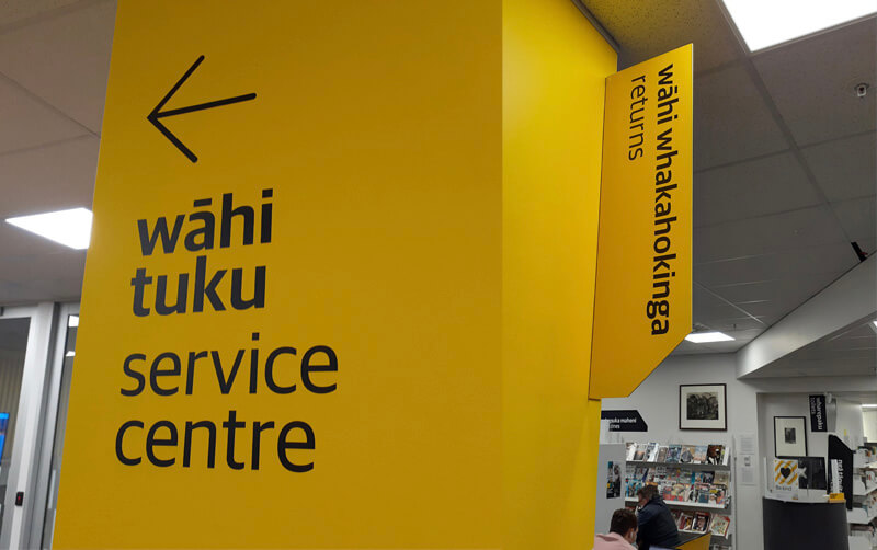
Some years ago, I was involved in one of the first bilingual traffic signs in Aotearoa New Zealand for Porirua City Council. It got some media attention at the time and I’ve noticed that bilingual signage is becoming much more common.

Porirua’s first bilingual road signs mark the streets around Takapuwahia Marae.
Some of the examples I’ve seen are council signage by Porirua City Council and Wellington City Council.

Porirua City Council signage in Pukerua Bay, Porirua.
Out of interest, I looked to see if there were any bilingual signage guidelines out there. I found that Te Puni Kōkiri, Ministry of Māori Development have put out a resource called ‘Māori-English Bilingual Signage. A guide for best practice’.
Their objective for developing the bilingual signage guidelines is to “Increase the visibility of te reo Māori in public spaces within the government (central and local) extending to business sectors, and thereby increase the usage of te reo Māori in every day conversation.”
They say when developing bilingual signage the key principles are:
- Responsive and accessible services
- Visibility of language
- Equality of language
- Quality of language
Te Puni Kōkiri says that embracing te reo Māori and culture in everyday public life helps establish a shared national identity and builds goodwill and social cohesion within Aotearoa New Zealand. That it’s a good business practice as it can help build staff pride, morale, and loyalty.
“Bilingual signage also offers the opportunity for organisational development through building staff capability to speak te reo Māori, and therefore their ability to work with Māori communities, and to communicate and negotiate with a range of customers in diverse situations.”
Te Puni Kōkiri’s guide is based on international literature and the United Nation’s best-practice principles of bilingual and multi-lingual language planning guidelines adopted in policies and guidelines in many countries. They say “the typographic rules applying to bilingual signage as an internationally recommended standard shows the “first language” (the one being revived), i.e.
the Māori text is at least as large as the font for the English text even if the text in one language is longer. Further, if this is not practical in terms of the eye easily reading at a glance, then the Māori text should dominate. The rationale is that English is an international language that most people know and understand. Customers will, therefore, have little difficulty in navigating themselves towards a building or within its work-spaces, or websites.”
“It makes sense to have the Māori on top; that’s how we keep the language alive.” DEPARTMENT OF INTERNAL AFFAIRS

Bilingual toilet signage in Arapaki Manners Library, Wellington City.
All great stuff but how exactly do we put that into practice? What does it look like?
Luckily TPK have distilled the main design points into a PDF. I’ve listed their Do and Don’t points below.

Some tips taken from TPK’s “Design tips to support quality bilingual signage” PDF
Bilingual signage tips
DO:
- Have the font for the Māori text at least as large as the font for the English, even if one text runs longer.
- Use an equal typeface for the Māori and English.
- Use the same font style for the Māori and English.
- Apply colour coding to text and or language – separating background panel.
- Be consistent in all signs with the same colour and position for each language.
- Consider how a pictogram might reduce the amount of text required.
- Place Māori first, either stacked or side by side.
- If both Māori and English cannot be easily read because signage is ‘visibly biased’ consider having the Māori only.
DON’T:
- Assign a heavier font or colour for English.
- Apply a dominant visual style to English.
- Use italics or symbols (– or /) to separate Māori and English.
- Squash Māori to match English text.
- Use CAPITALS to differentiate languages (e.g. CAPITALS and upper and lower case).
- Double up on icons.
As always there is more to learn, and I look forward to putting these tips into practice.
Here are some of the resources I found that you might find useful:
- TPK ‘Maori-English Bilingual Signage. A guide for best practice.
- Bilingual Signage – translation of common words
- TPK design tips pdf
- Te Reo resources
- School-related signage
- NZTA research notes on bilingual signage
- ReoMaori Bilingual Signage blog
 Pogo Design

 https://truestock.co.nz/mother-and-kids-jumping-on-trampoline/TS562716



 debby-hudson unsplash